The early 2000s were a very specific era in American home design. Houses were getting bigger, the housing market was booming, HGTV was becoming a full-time lifestyle influence, and “upgrade culture” was in full swing. Design choices weren’t meant to be subtle—they were meant to be noticed.
A lot of the decade’s most popular trends weren’t bad ideas in theory. In fact, many were genuinely exciting at the time. They made homes feel more dramatic, more luxurious, more modern, more finished. The problem is that many of them were also intensely of-the-moment. Once tastes shifted toward restraint, softness, and fewer “statement” decisions, these trends started to feel dated fast.
Looking back, the funniest part is how confident we all were about them.
Here are 17 home trends everyone loved in the 2000s that aged surprisingly badly.
#1 Tuscan kitchens with heavy wood and ornate tile
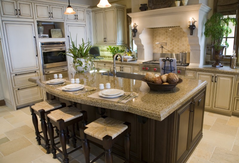
For a while, Tuscan style was the ultimate sign of taste. Dark cabinets, warm stone, tumbled tile backsplashes, decorative corbels — it all felt rich and worldly.
Now, it tends to feel themed. The heaviness can make kitchens look darker and busier than people want today, especially as lighter palettes and simpler cabinetry took over.
#2 Granite countertops with loud, high-contrast patterning
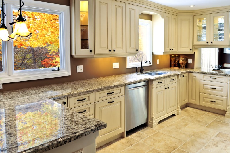
Granite was the dream countertop for years. It was expensive, durable, and unmistakably “upgraded.” The bolder the pattern, the higher-end it seemed.
Unfortunately, many of those high-contrast slabs now read as visual noise. As kitchens moved toward calmer surfaces, dramatic granite started looking like it’s competing with everything else in the room.
#3 Faux finishes (sponging, rag rolling, and painted texture everywhere)
The 2000s loved a faux finish. Walls were glazed, mottled, sponged, written on — anything to avoid plain paint. It was meant to add dimension and richness.
Today, it often looks like a room trying to be something it isn’t. Real texture is back (plaster, limewash), but faux texture tends to read as a dated workaround.
#4 Accent walls in deep, intense colors
Navy, burgundy, orange, red or chocolate brown — one dramatic wall was the go-to way to make a room feel designed. It felt modern and bold.
Now, many accent walls look unfinished, like someone stopped halfway through painting. People still love color, but it’s being used in more intentional, immersive ways.
#5 Beige everything
If the 1990s had a softer version of neutral, the 2000s went full beige. Beige walls, beige carpet, beige tile, beige furniture: it was safe, cohesive, and resale-friendly.
The problem is that it also made a lot of homes feel flat and lifeless. Today’s neutrals tend to have more depth, incorporating plenty of warm whites, earthy tones, and richer texture.
#6 Open shelving that was never meant to be functional
Open shelving started as a design flex: perfectly curated dishware and styled kitchen moments. In real life, it became a dust-and-chaos magnet.
Designers still use open shelves, but in smaller doses. The 2000s version often looks cluttered because it assumed everyone lives like a showroom.
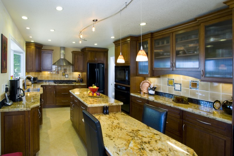
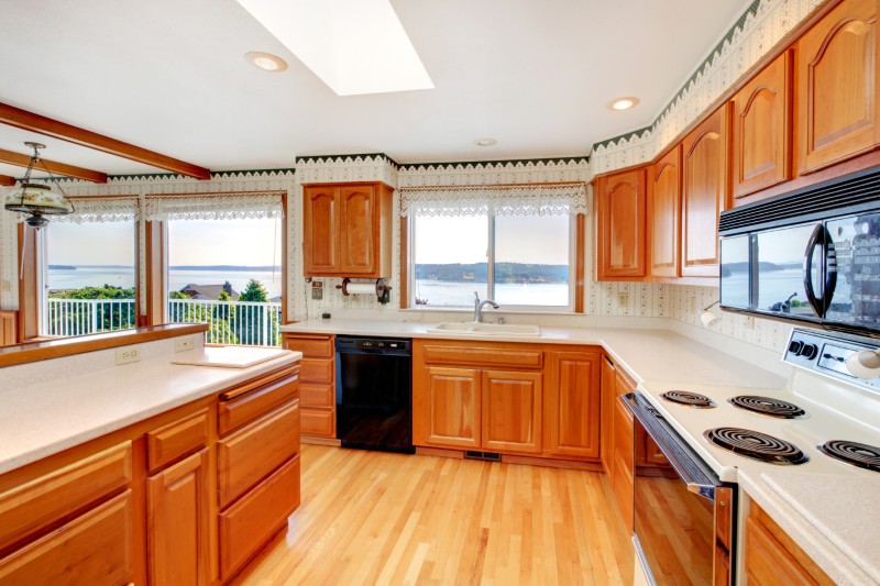
#7 Raised-panel cabinets (especially in orange-toned wood)
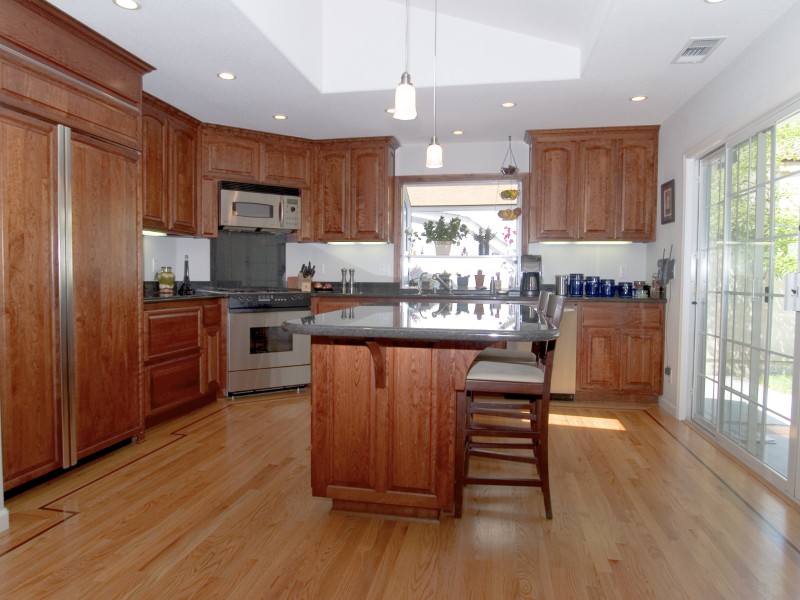
Those raised-panel cabinet doors were once the default “nice kitchen.” Paired with warm wood stains, they signaled traditional luxury.
Now, they often look overly busy. Flat-front cabinetry and cleaner profiles feel more modern, making raised-panel doors look instantly dated.
#8 Builder-grade recessed lighting everywhere
In the 2000s, recessed lighting was considered sleek and modern. Many homes installed can lights across entire ceilings like a grid.
But it created harsh light and “runway ceiling” vibes. Today, lighting is more layered and softer, more about atmosphere than brightness.
#9 Track lighting (especially the twisty chrome kind)
Track lighting felt futuristic: adjustable, shiny, and modern. It was the easiest way to signal “updated lighting.”
Now, it often looks like a default choice from a home improvement store aisle. It reads more functional than stylish, and not in a charming way.
#10 Jetted tubs as the ultimate bathroom luxury
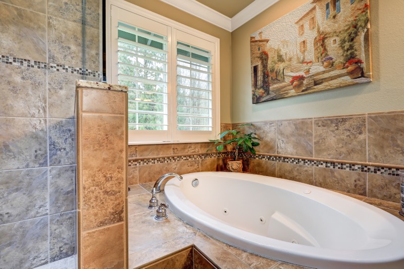
Nothing said 2000s luxury like a giant jetted tub. It implied spa living, even if it was mostly used twice a year.
Over time, people realized they’d rather have a larger shower, better storage, and more calm. Jetted tubs also didn’t age well maintenance-wise, so they started feeling like a burden.
#11 Vessel sinks

The vessel sink era was brief but powerful. Bowls sitting on top of vanities looked like hotel luxury, especially paired with tall faucets.
Now, many people associate them with awkward usability — splashes, cleaning issues, and dated design. They can still look beautiful, but they’re far less “must-have” than they once were.
#12 Glass block walls
Glass block returned in the 2000s as a privacy-with-light solution, especially in bathrooms and entries. It looked architectural and modern.
Today it reads bulky and very specific to that era. It’s hard to integrate without making a house feel instantly time-stamped.
#13 Wallpaper borders (especially the kitchen ones)
Wallpaper borders were the go-to “detail” that made spaces feel finished: ivy, grapes, country motifs, tiny patterns near ceilings.
The issue is they now feel like décor rather than design. Most people removed them quickly once tastes shifted toward cleaner walls.
#14 The oversized themed “statement” backsplash
Many 2000s kitchens featured decorative tile murals, busy mosaics, or high-contrast stone backsplashes designed to be the star.
Today, backsplashes often aim for calm. When the backsplash is screaming, it can make a kitchen feel visually exhausting.
#15 Giant entertainment centers built around bulky TVs
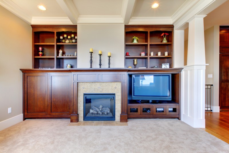
Back when TVs were deep and heavy, entertainment centers made sense. They were meant to hide wires, store DVDs, and create a “media wall.”
Once flat screens arrived, these units became awkward relics. Many were ripped out, leaving oddly shaped spaces and mismatched proportions behind, and the 2000s were yet to adapt.
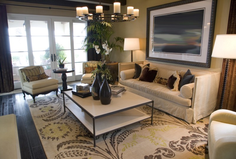
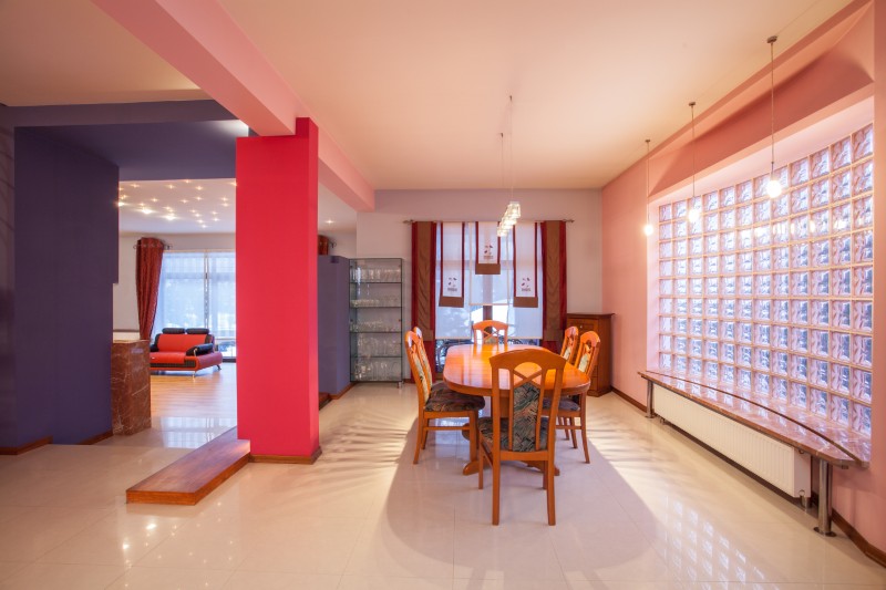
#16 Overly formal furniture in everyday rooms
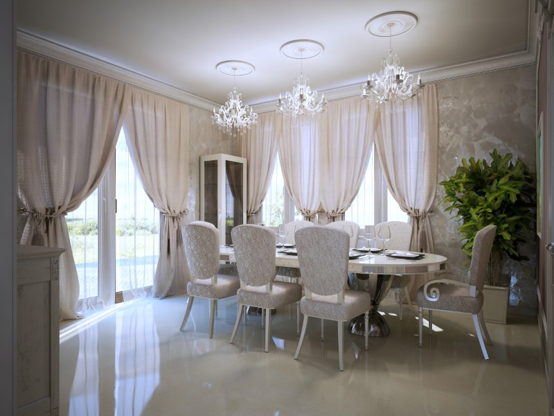
The 2000s loved a formal living room setup: matching sets, stiff seating, and a room that looked great but wasn’t easy to live in. And don’t even get us started on the dining rooms, they looked like they were prepped to host city officials.
The shift toward casual living made these rooms feel untouchable. Today, comfort is the status symbol.
#17 Trying to make every room feel “fancy”
This might be the most 2000s trend of all: the belief that every space should have a dramatic finish, a grand gesture, or a strong theme.
Today’s best homes don’t do that. They allow quiet rooms. They allow negative space. They allow things to feel normal and lived-in, which ironically reads far more luxurious now.
More stories
10 home features that defined the 1990s (and where they went)
What a “modern home” meant in every decade since the 1950s
15 things older homes do much better than new builds
The post 17 Home trends everyone loved in the 2000s that aged surprisingly badly appeared first on Fancy Pants Homes.
