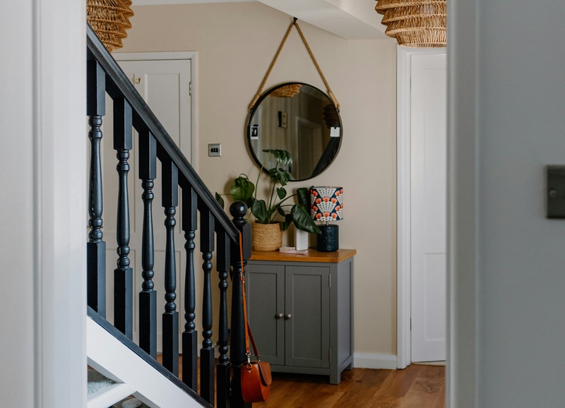
A renovated home can look beautiful on the surface and still quietly reveal where corners were cut. Designers aren’t looking for luxury finishes so much as consistency, planning, and how thoughtfully changes were executed.
Shortcuts tend to show up in the same places again and again, especially when a renovation was rushed, budget-driven, or focused on fast resale instead of long-term living.
Most of these decisions don’t scream “cheap.” They whisper it through proportion issues, awkward transitions, and details that feel unfinished.
Here are 15 renovation shortcuts designers can spot instantly, even in homes that appear fully updated.
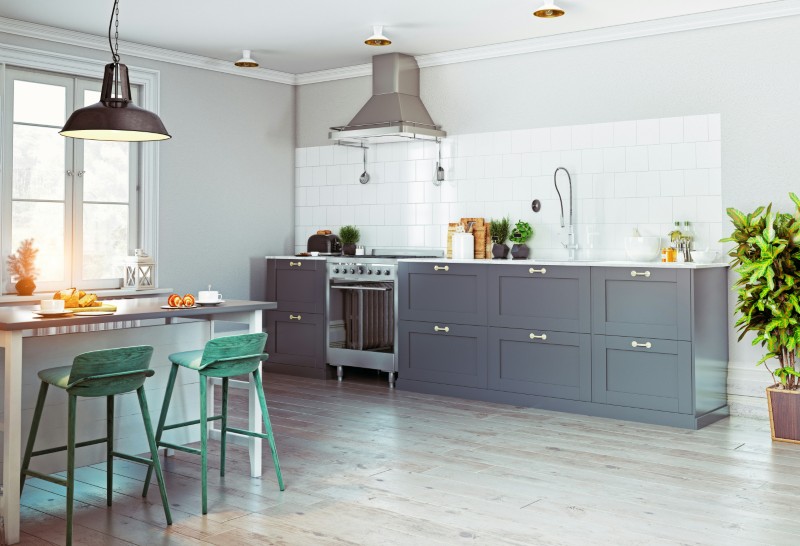
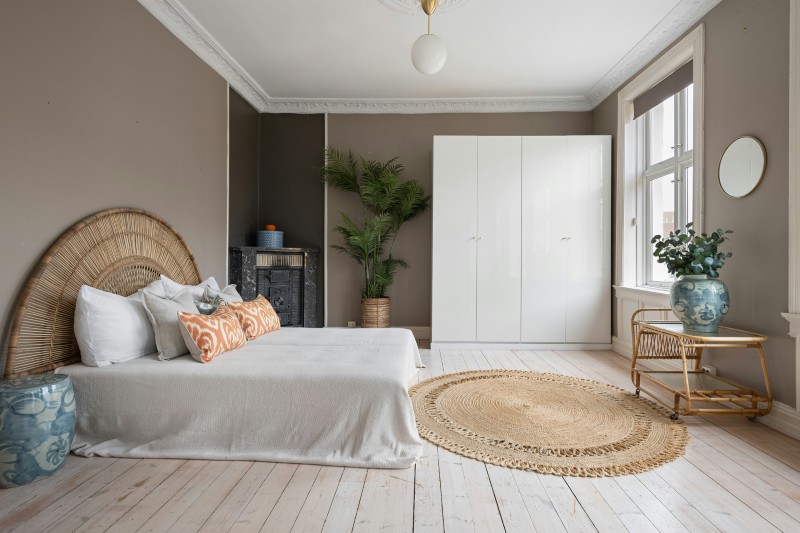
Flooring changes at every doorway
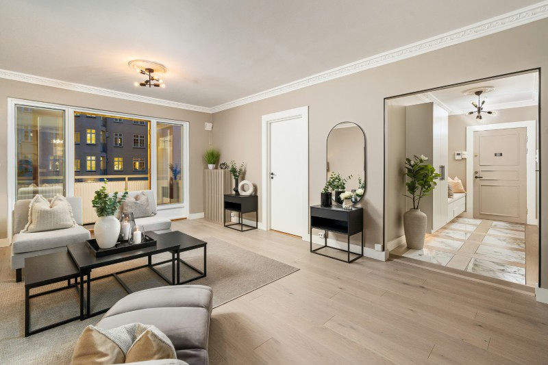
One of the most common shortcuts is switching flooring types room to room to save money or avoid leveling work. The result is a house full of visual breaks.
Designers prefer continuous flooring across main living areas because it creates flow and instantly feels more custom and intentional.
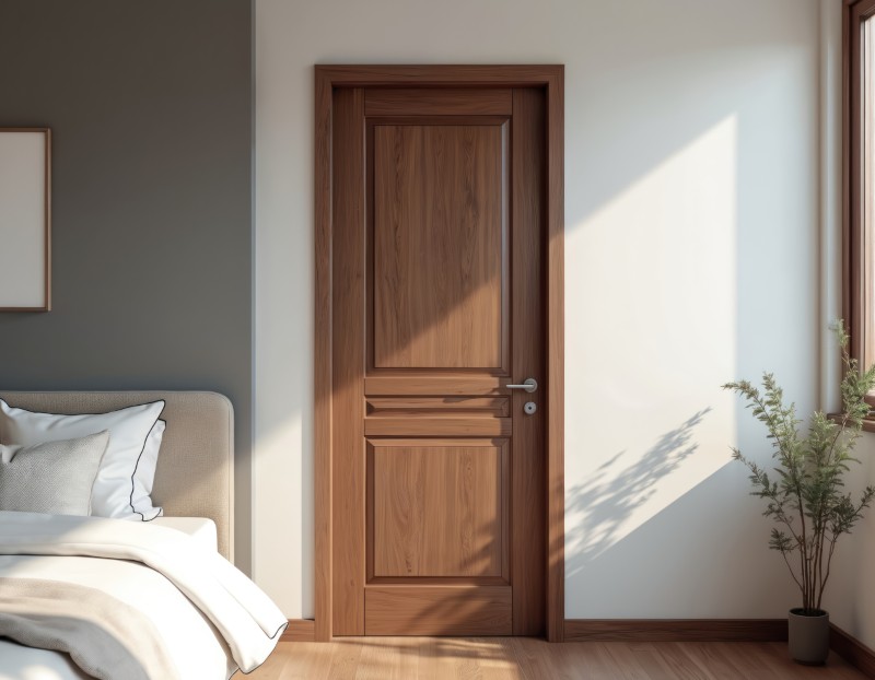
New cabinets paired with old trim and doors
Fresh kitchens next to dated baseboards, hollow-core doors, or mismatched trim profiles reveal where the renovation stopped short.
High-quality renovations update surrounding architectural details so the old doesn’t undermine the new.
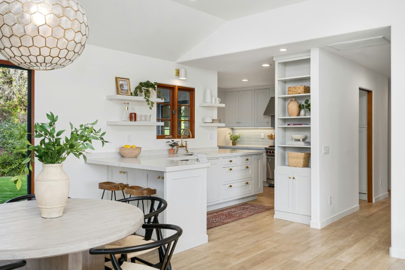
Finishes upgraded in only the “visible” rooms
A beautiful kitchen paired with untouched hall baths or secondary spaces shows where budgets were concentrated for resale appeal.
Designers aim for consistency across the whole home.
Skipped storage upgrades (and planning)
Renovations that ignore pantry space, linen closets, or drop zones often feel superficial. And don’t even get us started on how quickly a living room without storage can turn from chic to messy.
High-quality renovations improve function, not just finishes.
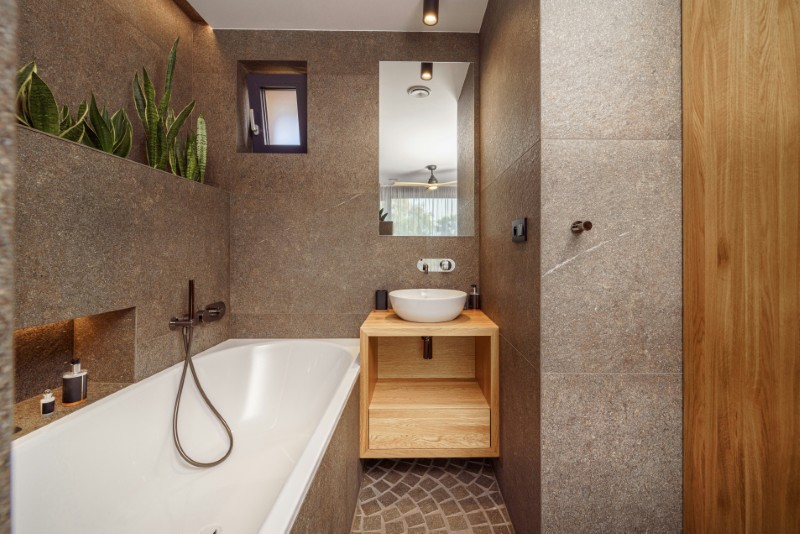
Tile that stops awkwardly instead of wrapping properly
Backsplashes that end mid-wall, shower tile that stops short of ceilings, or odd termination points often signal cost-cutting.
Designers typically extend materials fully so spaces feel finished and cohesive.
Cheap filler strips around cabinets and appliances
Tiny filler panels used to close gaps between cabinetry and walls are a huge giveaway.
Custom-feeling kitchens plan layouts precisely so these gaps don’t exist — or are integrated seamlessly.
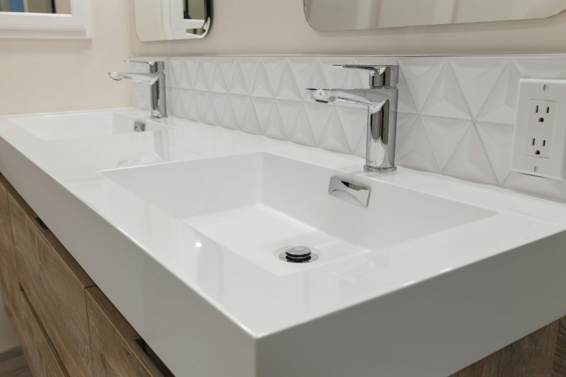
Mismatched hardware throughout the house
Different knob styles, finishes, and sizes room to room suggest piecemeal upgrades. And a designer’s trained eye (and keen aesthetic senses) will pick up on this right away.
Thoughtful renovations unify hardware choices to create cohesion.
Overly narrow countertops and islands
Sometimes layouts are squeezed to avoid moving plumbing or walls, leaving islands that are awkwardly skinny.
Designers prioritize functional proportions — even if it requires structural changes.
Visible transition strips between flooring types
Bulky transition pieces often signal rushed installation or height differences that weren’t properly addressed.
Well-executed renovations create flush transitions that disappear visually.
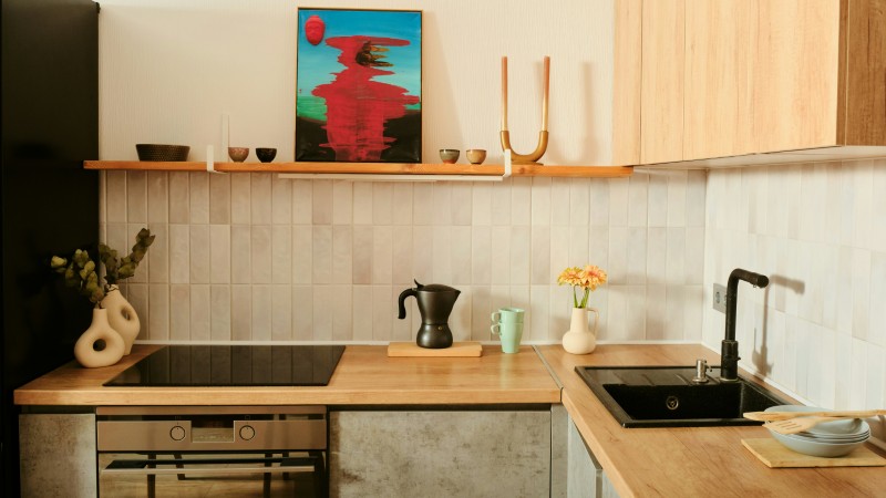
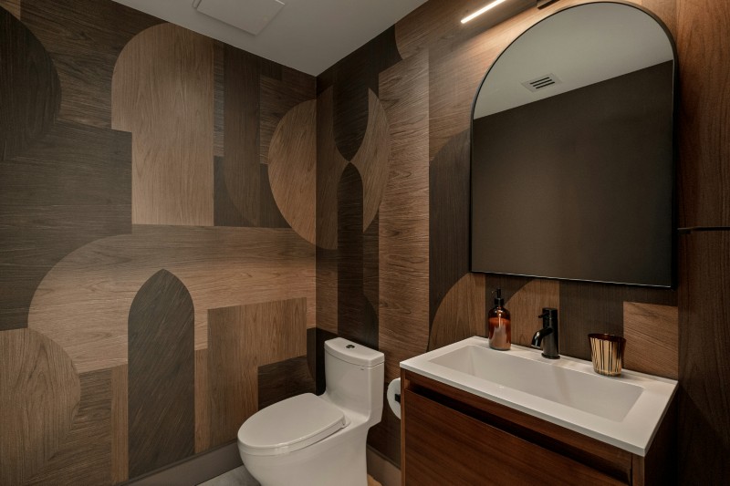
Builder-grade lighting in otherwise renovated spaces
A brand-new kitchen with a basic flush mount light instantly feels unfinished. Same goes for the bedroom, living area, or dining room.
Lighting is one of the biggest indicators of renovation quality — designers always upgrade it.
Tile patterns that don’t align or wrap corners
Misaligned grout lines, poorly centered tile layouts, or patterns that stop awkwardly around corners show lack of planning.
Professional installations account for symmetry and flow.
Vanity tops that barely fit the cabinet
Overhangs that are too small, uneven, or awkward often come from off-the-shelf shortcuts.
Custom-feeling renovations plan proportions carefully.
Poorly placed outlets and switches
When electrical layouts aren’t rethought, outlets end up behind doors, in odd spots, dangerously close and exposed to water sources, or missing where needed.
Designers always rework electrical to suit the new layout.
Paint-only “updates” on old surfaces
Sometimes outdated cabinetry, doors, or trim are simply painted rather than replaced or properly updated.
Paint can refresh — but when it’s the only change, designers spot it immediately.
Thin tile or laminate that mimics higher-end materials
Materials chosen to “look like” stone, marble or wood but feel flimsy underfoot or at edges are easy tells.
Quality renovations invest in authentic-feeling surfaces.
More stories
18 Things designers would change first in a builder-grade house
20 design mistakes that instantly make a home feel cheaper than it is
19 Five-figure-looking home upgrades that actually cost under $500
The post 15 renovation shortcuts designers can spot instantly appeared first on Fancy Pants Homes.
