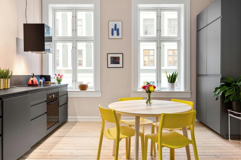
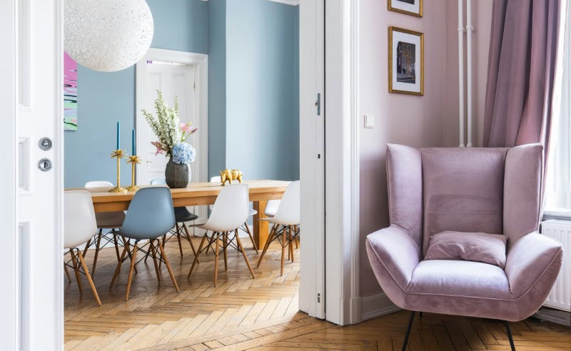
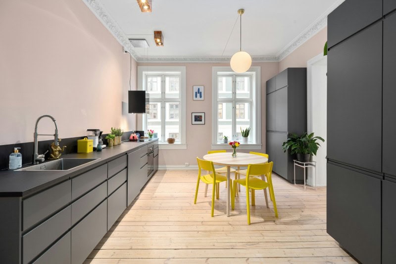
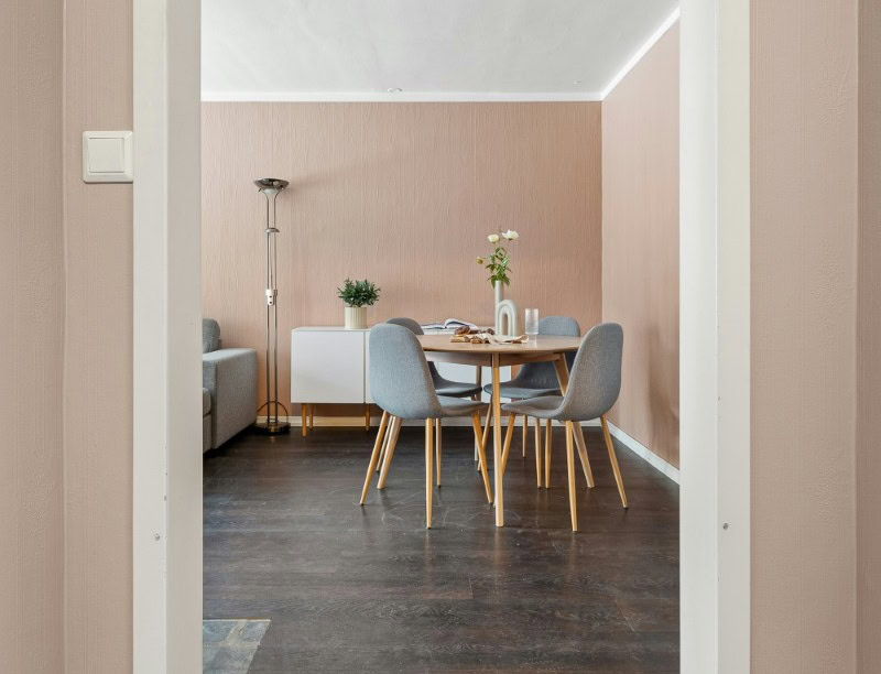
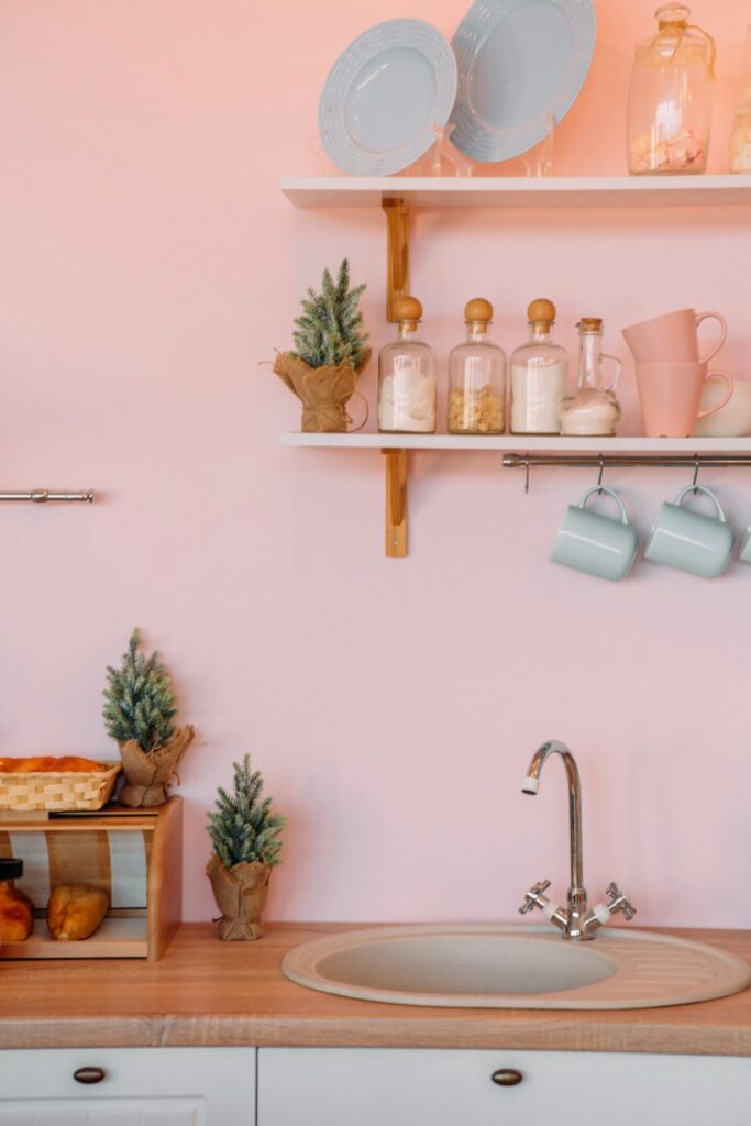
Choosing paint should be one of the most enjoyable parts of decorating a home. A fresh color can completely transform how a space feels, making it brighter, calmer, or more welcoming.
But according to art expert Jessie Brooks, Product Manager at Davincified, some shades can have the opposite effect, particularly certain pinks that have become popular in recent years.
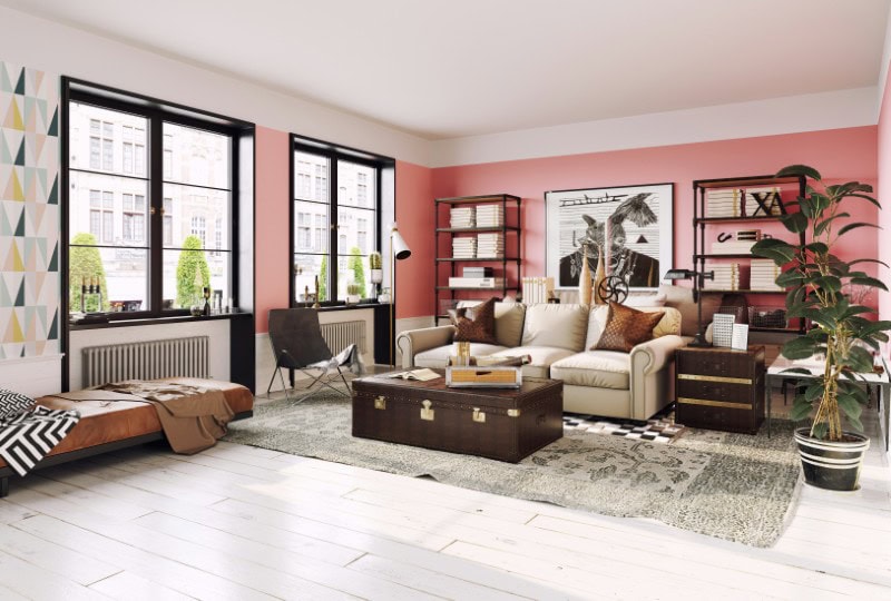
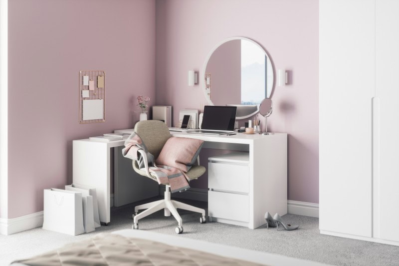
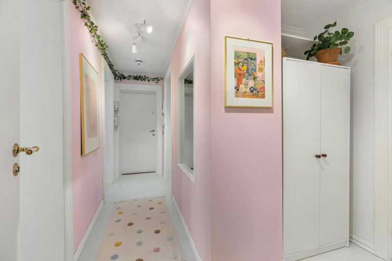
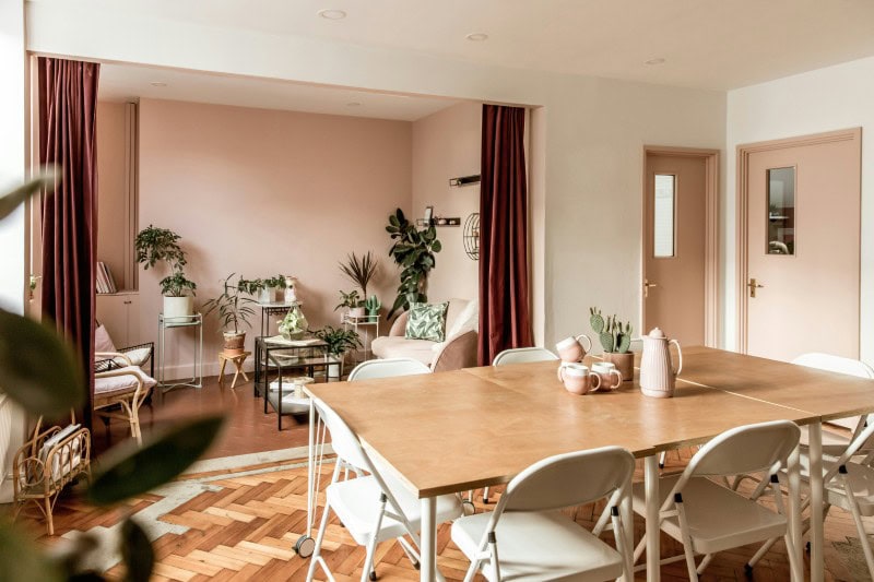
While pink can work beautifully in accents or textiles, Brooks warns that specific wall shades — particularly muddy blush tones and outdated bubblegum pinks — often leave rooms looking dull, dated, and harder to sell.
Here are the subtle reasons designers say those colors tend to fall flat.
Muddy blush tones absorb light instead of reflecting it
Many blush tones became popular because they initially looked soft and sophisticated in photos.
But on large wall surfaces, the grey undertones in muddy blush paints tend to absorb natural light rather than reflect it. Instead of making a room glow, they flatten the space.
According to Brooks, this often leaves rooms feeling darker and slightly lifeless — especially in spaces that don’t receive abundant daylight.
Over time, what once looked trendy can start to feel dull.
They can make rooms feel smaller than they actually are
Paint color strongly affects how spacious a room appears.
Lighter neutrals bounce light around the space, helping walls visually recede. Muddy pink tones do the opposite.
Because they lack brightness and warmth, they can make walls feel closer and ceilings feel lower. The result is a room that feels subtly more confined.
Even large spaces can lose their sense of openness.
Bubblegum pink tends to date quickly
Bright pink walls can look fun and playful at first.
But Brooks notes that bold colors with strong personality tend to age quickly. What feels lively one year can start to feel childish or overwhelming a few years later.
Because trends move quickly, homeowners often end up repainting far sooner than they expected.
They compete with furniture and artwork
Strong or muddy pink walls tend to dominate the visual field of a room.
That makes it harder for furniture, artwork, or architectural details to stand out. Instead of acting as a backdrop, the wall color becomes the main event.
Brooks suggests that the most successful wall colors are ones you eventually stop noticing because they allow the rest of the room to shine.
Pink walls can really complicate decorating choices
A strong wall color places limits on what works around it.
Certain woods, fabrics, and metals can clash with pink tones, making it harder to update furniture or accessories later. Even artwork can suddenly feel out of place.
Neutral walls offer far more flexibility when decorating evolves over time.
Buyers often see pink walls as a project
Real estate agents frequently report that bold or highly specific colors make buyers nervous.
When viewers walk into a pink room, many immediately assume they’ll need to repaint before moving in. That extra work becomes part of their mental calculation when making an offer.
Brooks notes that buyers generally prefer spaces that feel like a blank canvas.
It can subtly affect the mood of a room
Color psychology isn’t just a marketing concept — it genuinely influences how spaces feel.
Muddy pink tones often fall into an awkward middle ground. They aren’t energetic like brighter colors, but they also lack the calm neutrality of creams or soft greys.
The result can feel slightly stagnant or uninspiring over time.
Certain pinks change dramatically depending on lighting
Wall colors rarely look the same throughout the day.
Pink shades can shift dramatically as natural light changes. Morning light may make them appear pale and pleasant, while evening light can bring out grey or purple undertones.
That inconsistency can make a room feel unpredictable.
The color can dominate smaller spaces
In compact rooms, strong wall colors take up a larger percentage of the visual field.
Instead of creating depth, they can overwhelm the space.
This is one reason designers often reserve pink for smaller accents like textiles, pillows, or artwork rather than entire walls.
Trend-driven colors rarely age gracefully
Interior color trends move quickly.
The blush tones that dominated social media a few years ago are already starting to feel dated in many homes.
Brooks points out that homeowners who chase trends often end up repainting every few years just to keep up.
It limits how future home buyers imagine the space
Neutral walls allow people to imagine their own furniture and style in a home.
Pink walls impose a very specific aesthetic, which makes it harder for buyers to picture themselves living there.
This can subtly reduce the emotional connection people feel when touring a property.
Some pink shades develop a “dingy” look over time
Brooks notes that muddy blush colors often lose their freshness quickly.
Because they already contain grey undertones, even small amounts of wear or fading can make the walls look slightly dirty or dull.
Rooms that once felt stylish can begin to feel tired.
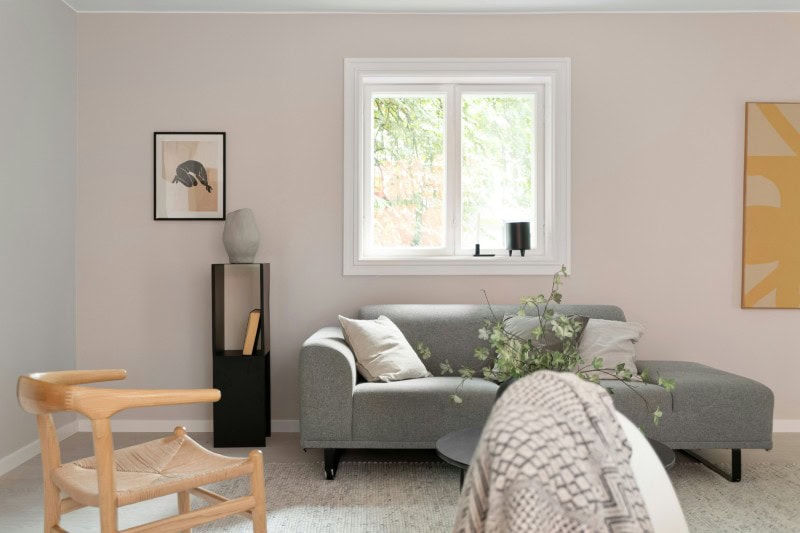
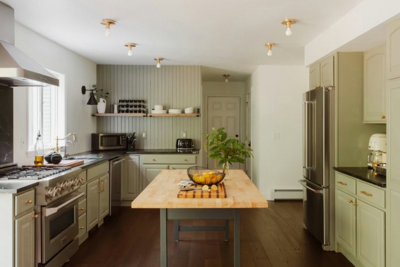
There are much better wall color alternatives for creating warmth
Homeowners who love warm tones don’t necessarily need to avoid color altogether.
Brooks suggests exploring terracotta shades, soft peach tones, or warm creams. These colors reflect light more effectively and work with a wide range of furniture styles.
They also tend to age more gracefully.
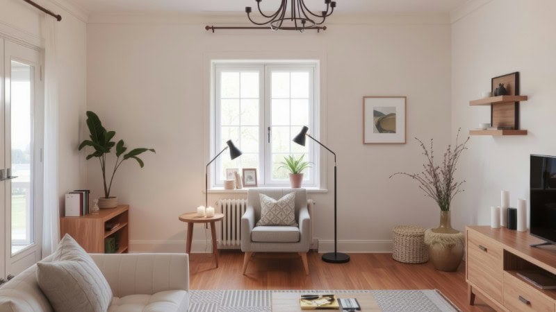
The best wall colors are the ones you stop noticing
The most successful interiors rarely rely on bold wall colors for personality.
Instead, the walls act as a quiet foundation that allows art, furniture, and everyday life to take center stage.
As Brooks puts it:
“Timeless shouldn’t mean boring. Warm neutrals and earthy tones create inviting spaces that work with any style. When the base color feels right, everything else in the room falls into place.”
A special thank you to Davincified, a premium online platform offering custom paint-by-numbers kits that transform personal photos into beautifully accessible artworks, along with AI-powered features, for providing us with their insight.
More stories
19 things designers wish homeowners would stop doing
25 spring resets designers always recommend after a long winter
15 ways older homes feel much warmer than new builds
The post Expert reveals the one color you should never paint your walls (and why) appeared first on Fancy Pants Homes.
