Scroll long enough on Instagram and a pattern starts to emerge.
Kitchens without so much as a toaster. Living rooms that look like no one has ever sat down. Bedrooms with rumpled linen (but in a way that feels suspiciously rehearsed).
These homes photograph beautifully. Living in them is another story.
Over the past decade, social media has quietly reshaped home design. Clean lines got cleaner. Open shelves replaced cabinets. Entire rooms began revolving around a single photogenic moment: a tub, an arch, a chair no one actually sits in.
The result is a wave of remodels optimized for likes, not longevity. Here are the telltale signs a house was remodeled for the algorithm first, and daily life second.
The all-white kitchen that fears spaghetti sauce
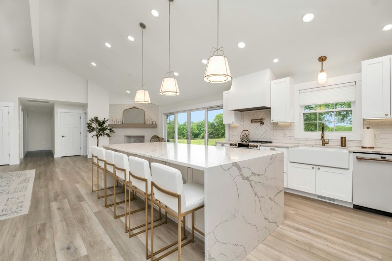
White kitchens aren’t anything new, but the Instagram version takes things to extremes.
White cabinets, white counters, white backsplash, and often white floors to match.
Sure, it looks crisp in photos. But in reality, every coffee drip, turmeric spill, and tomato splash becomes a crisis. These kitchens often function more as backdrops than workspaces, with visual purity taking priority over durability.
Bonus clue: paper towels are nowhere in sight.
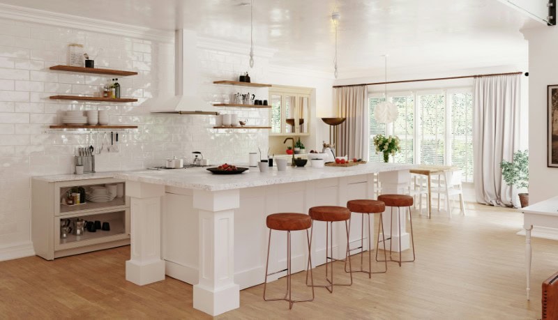
Open shelving with nothing practical on it
Open shelves filled with identical neutral bowls, artfully stacked cutting boards, and maybe a small vase branch are a dead giveaway.
What’s missing says more than what’s there: mismatched mugs, bulky appliances, cereal boxes, or anything that suggests actual eating habits.
These shelves are curated displays, not storage systems.
The freestanding tub placed nowhere near a towel
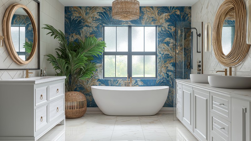
Few features photograph better than a sculptural soaking tub. Especially when placed dramatically in the center of the room or in front of a massive window.
What’s often missing: towel hooks, bath mats, or any sign that someone actually gets out of the tub wet and cold.
These tubs are built for the camera angle first.
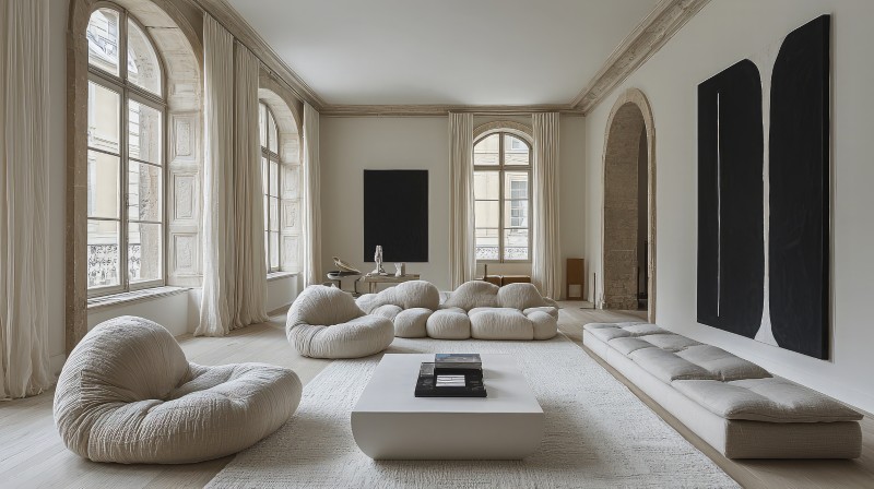
The living room with one chair and no TV
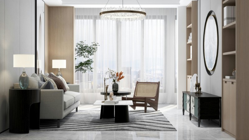
There’s usually one statement chair, one small sofa, and a coffee table holding a single oversized book.
What’s absent is equally notable: no TV, no remotes, no visible cords, and definitely no signs of binge-watching anything.
It’s less a living room and more a still life.
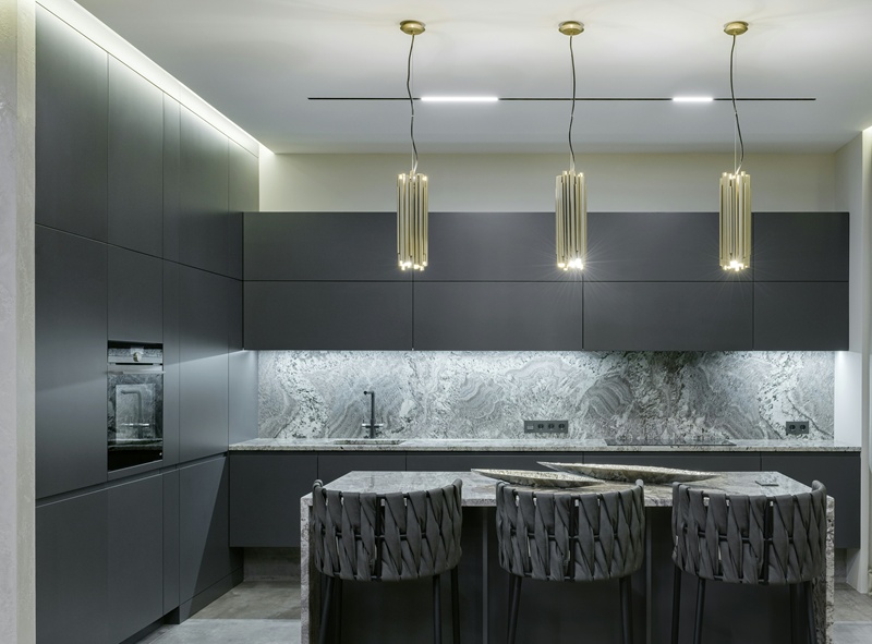
The kitchen island with zero seating comfort
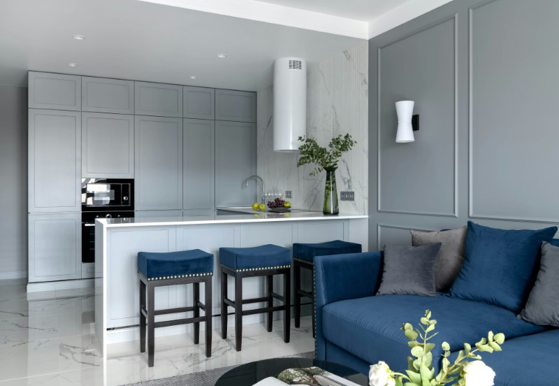
Long waterfall islands dominate Instagram-friendly remodels.
And while there’s no denying that they look sleek and uninterrupted, the come with stools that are often backless, rigid, and spaced more for symmetry than conversation.
Sitting there for more than 20 minutes feels like waiting for a delayed flight. Comfort rarely wins over clean lines.
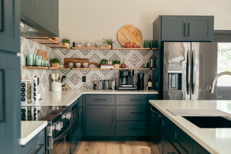
The disappearance of upper cabinets entirely
Upper cabinets quietly vanished in many remodels, replaced by blank walls, windows, or open shelving.
The visual effect is lighter and more architectural. The practical effect is dramatically less storage. Somewhere, everything that used to live there got relocated (or hidden).
The perfectly arched doorway that leads nowhere special
Arches have become a signature Instagram remodel move. They soften spaces and photograph beautifully.
But often, they exist purely as decorative transitions, not structural necessities. Their main job is framing the next shot. Functionally, they change very little.
The absence of overhead lighting
Instead of ceiling fixtures, these homes rely on lamps, sconces, and natural light. It creates a warm, flattering glow in photos that’s undeniable.
At night, however, entire rooms can feel like upscale restaurants permanently stuck in mood lighting. Finding a dropped earring becomes quite the challenge.
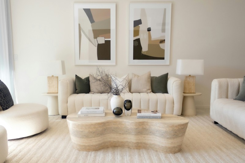
The coffee table that holds only one book
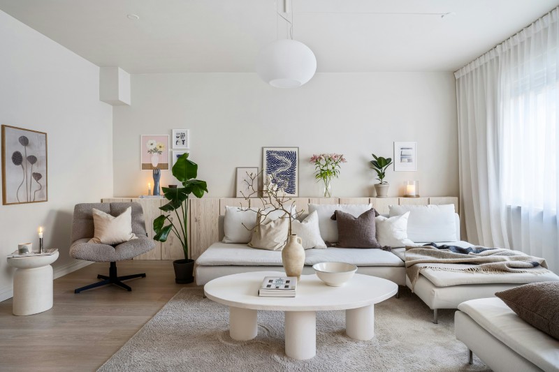
Usually it’s something oversized, fashion-related, and neutral-toned.
The book’s purpose isn’t reading. It’s staging.
No coasters, remotes, or everyday clutter are allowed to interrupt the composition.
The invisible refrigerator
Panel-ready appliances that blend seamlessly into cabinetry have become a hallmark of social-media remodels.
They create clean visual lines — but also make guests open random cabinets trying to find the fridge.
Form wins again.
The bed that looks like no one has ever slept in it
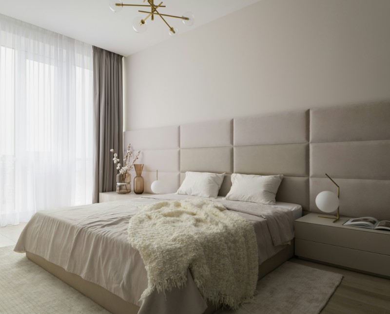
Perfectly layered linen bedding, symmetrical pillows, and zero personal items on the nightstands signal a room designed for photos.
Real bedrooms accumulate books, chargers, and evidence of actual sleeping. These don’t.
The total absence of personal photos
Instagram-optimized homes rarely show family photos, kids’ art, or personal memorabilia.
The aesthetic depends on universality. The less specific the home feels, the more widely appealing it becomes.
It’s designed to belong to everyone, and no one at the same time.
The sculptural chair no one is allowed to sit in
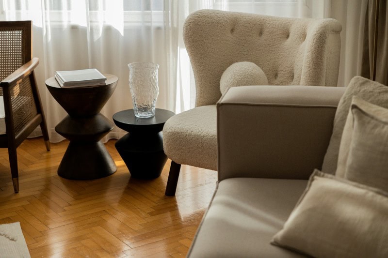
Bouclé accent chairs and curved sculptural seating appear constantly.
They look incredible. They’re also often uncomfortable, delicate, or positioned like museum objects.
Their primary role is visual punctuation and showing that the owner likes to stay up to date with current trends.
The carefully empty countertops and furniture
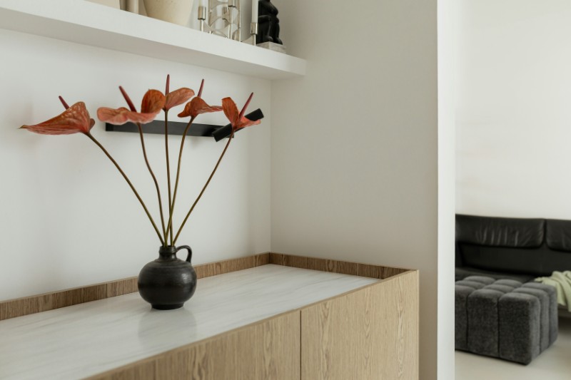
Real furniture collects things: mail, keys, appliances, groceries. There’s more than a trendy, neatly arranged fruit bowl or a sculptural vase lying around, there are signs of days to day like that even the most diligent resident can’t always stay on top off.
Instagram remodels erase all of it, leaving only maybe a bowl, a branch, or a single olive oil bottle.
The emptiness is intentional.
The Instagram version of good design
Instagram didn’t invent good design, but it does (and did) standardize a certain version of it. One that prioritizes visual calm, simplicity, and photogenic moments. These homes succeed at what they were built to do: look beautiful on a screen.
Living in them, however, is a different experience entirely. And sometimes, the biggest sign a home was remodeled for Instagram isn’t what’s there.
It’s what’s missing.
Больше историй
17 модных тенденций в дизайне интерьера, которые всем нравились в 2000-х, но, как ни странно, плохо состарились.
13 особенностей, которые ненавязчиво говорят о том, что у домовладельца изысканный вкус.
20 дизайнерских ошибок, из-за которых дом мгновенно кажется дешевле, чем он есть на самом деле.
Пост 14 signs a house was remodeled for Instagram, not life впервые появился на Дома с модными брюками.
