Scroll through enough listing photos and you start to notice a pattern.
Certain design choices show up again and again — bright, clean, and undeniably photogenic. They pop on camera, look great in thumbnails, and give a house that instant “updated” feel buyers expect.
But once you step inside, some of those same features don’t hold up quite as well.
They may be impractical, uncomfortable, or simply disconnected from how people actually live. The issue isn’t always quality — it’s that many flips are designed to photograph well first, and function well second.
Here are some of the most common flip features that look great online but fall short in real life.
All-white kitchens that show every mark within days
Few things photograph as cleanly as an all-white kitchen.
White cabinets, white countertops, and white backsplashes reflect light beautifully and create that bright, airy look buyers love in listing photos. The space feels fresh and modern at first glance.
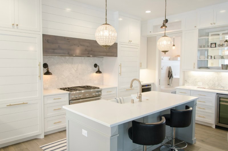
But in daily life, that same palette can become high-maintenance. Fingerprints, food splatters, and small scuffs show up quickly, especially around handles and high-traffic areas.
What looks pristine in photos often requires constant upkeep to stay that way, and you’re always left feeling like you’re failing to keep it looking its best.
Open shelving that replaces upper cabinets entirely
Open shelving is a favorite in flipped kitchens because it feels light and visually appealing.
Styled with a few dishes, plants, or glassware, it creates a relaxed, curated look that reads well on camera.
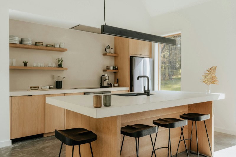
In practice, though, open shelves require constant organization. Everyday items quickly create visual clutter, and dishes are exposed to dust and grease.
Without upper cabinets, storage becomes more limited than expected.
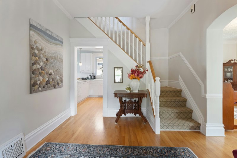
Barn doors used where real doors would work better
Barn doors have become a staple of modern flips, often used for bathrooms, bedrooms, or closets.
They photograph well and add a bit of visual interest, especially in neutral interiors.
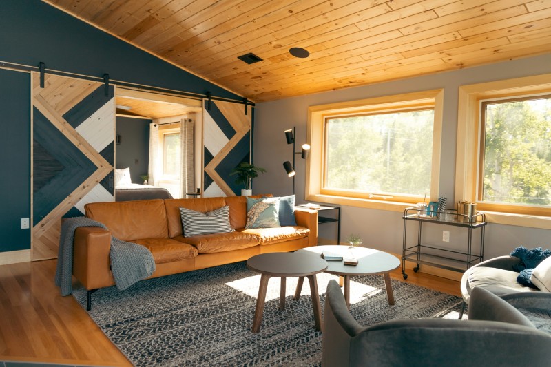
But they rarely provide the privacy or sound insulation of a traditional door. Gaps around the edges let in light and noise, which becomes especially noticeable in bathrooms or shared living spaces.
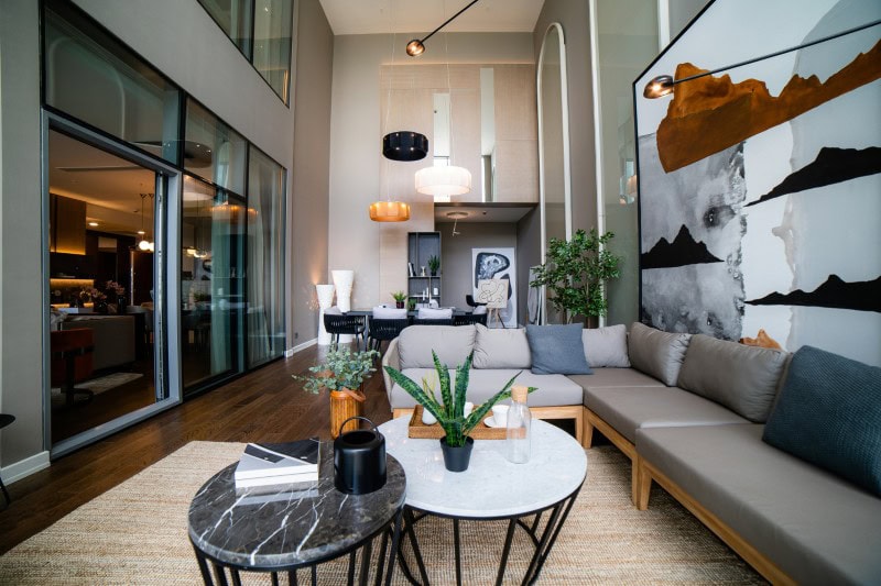
Statement light fixtures that overwhelm the room
A bold light fixture can instantly elevate a listing photo.
Large pendants or sculptural chandeliers draw the eye and make a space feel designed rather than generic.
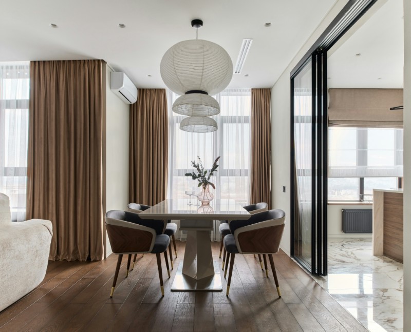
However, when the scale isn’t right, these fixtures can dominate the room.
They may hang too low, block sightlines, or feel visually heavy in smaller spaces, making the room feel more cramped than intended.
Dark accent walls that absorb more light than expected
Accent walls often appear dramatic and stylish in photos.
Deep charcoal, navy, reds, greens, or black can add contrast and depth when captured under ideal lighting conditions.
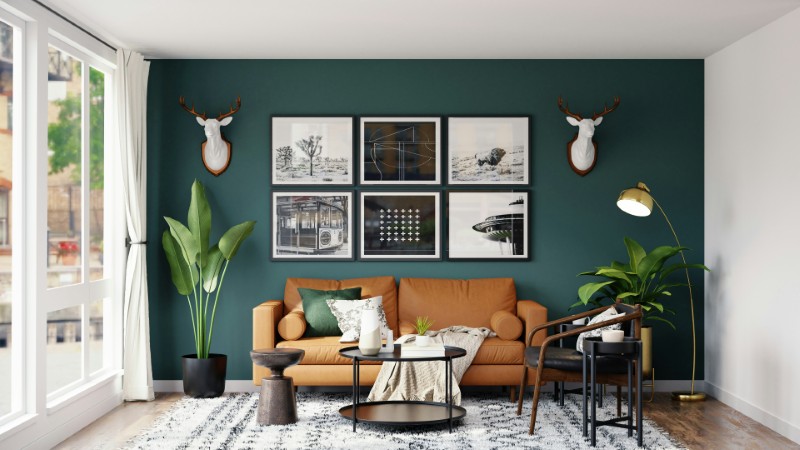
In real life, though, these colors can absorb light and make the room feel smaller or dimmer, especially if natural light is limited. The effect can be heavier than expected once you’re actually in the space.
Oversized kitchen islands that interrupt movement
Large kitchen islands photograph beautifully and signal a modern layout.
They suggest space for cooking, dining, and gathering all in one place.
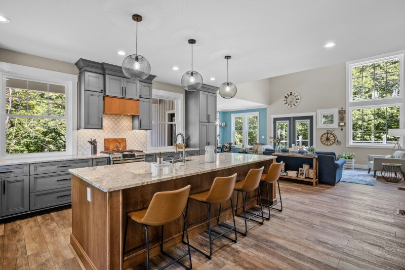
But when pushed too far, islands can disrupt circulation. Walkways become tight, appliances are harder to access, and the kitchen starts to feel less efficient despite its size.
Uniform grey finishes that flatten the entire space
Grey became a go-to color in flips because it feels neutral and modern.
Used thoughtfully, it can work well. But when applied everywhere — floors, walls, cabinets, and trim — it can flatten the space.
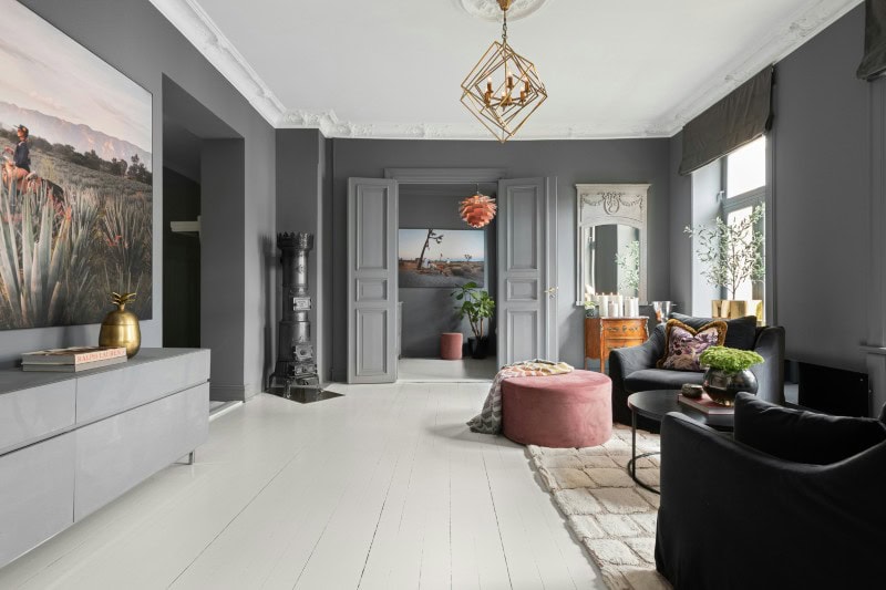
Without variation in tone or material, rooms lose depth and warmth, making them feel more generic than inviting.
Sliding glass doors without enough shade or privacy
Large sliding doors create a strong indoor-outdoor connection and photograph beautifully.
They bring in light and open up views, making rooms feel larger in listing photos.
But without proper shading or privacy planning, they can introduce glare, heat, and exposure. Rooms may feel too bright during the day and too visible at night.
Minimal closets that look clean but lack storage
In photos, uncluttered closets feel appealing.
They suggest simplicity and order, especially when styled with just a few hanging items.
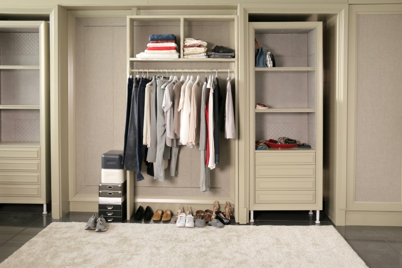
In real life, though, storage becomes a daily concern. Without enough shelving, drawers, or hanging space, belongings quickly spill into other areas of the home.
Bathrooms with minimal counter space
Streamlined vanities look sleek and modern in photos.
They often feature clean lines and minimal surfaces, which helps the room feel open.
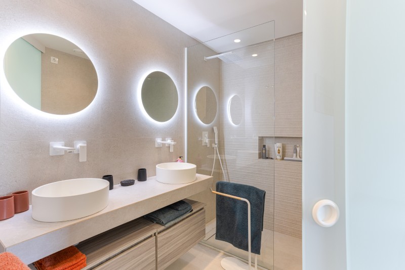
But daily routines require space.
Toothbrushes, skincare, and everyday items need somewhere to go, and without enough counter area, the bathroom can quickly feel cramped.
Highly patterned tile that dominates the room
Patterned tile can create a strong visual moment.
In photos, it adds personality and draws attention to kitchens or bathrooms.
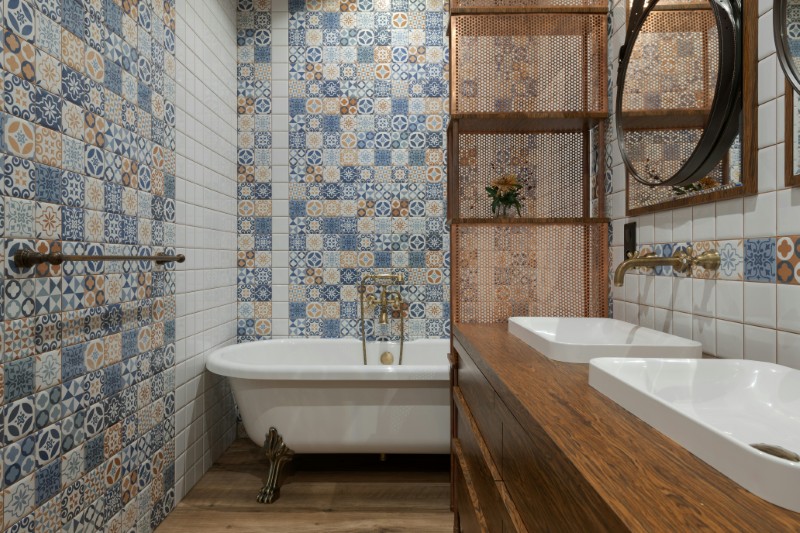
Over time, though, bold patterns can feel overwhelming. They compete with other elements in the room and can limit how the space is decorated later.
Ultra-trendy fixtures that date quickly
Flips often lean into current trends to attract attention.
Black faucets, unusual shapes, or highly specific styles can feel fresh at the moment.
But trends move quickly. What feels current today can start to feel dated within a few years, making the home seem older than it is.
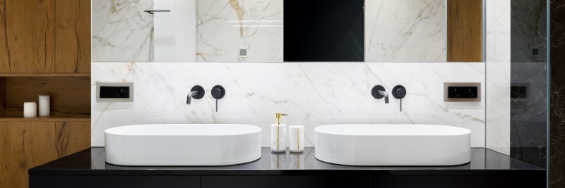
Floating vanities that sacrifice storage for style
Floating vanities create a sense of openness and look great in photos.
They expose more floor area, which can make small bathrooms appear larger.
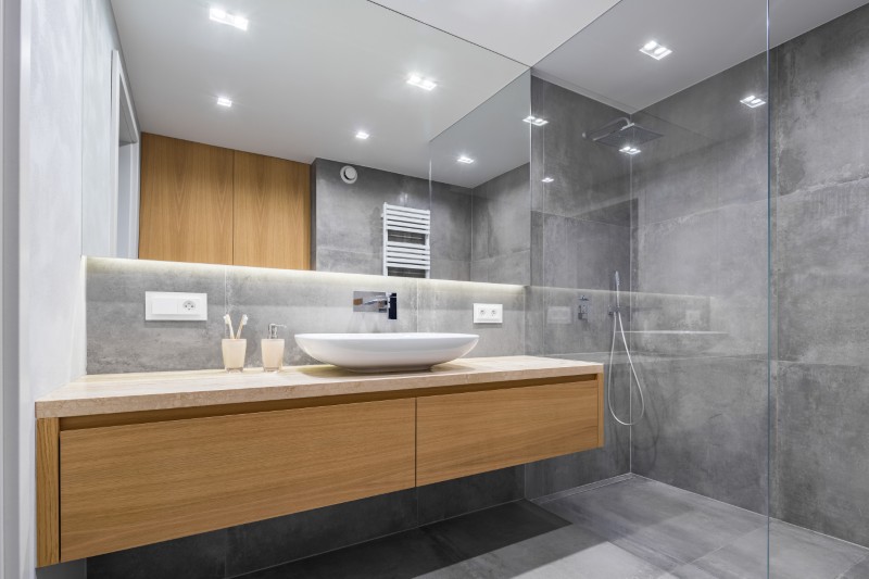
However, they often reduce storage space.
Without enough drawers or cabinets, everyday items end up crowding the surface or moving elsewhere.
Overly staged “perfect” rooms that don’t reflect real use
Some flipped homes are staged to perfection.
Every pillow is placed just right, every surface is styled, and the room feels almost untouched.
While this looks great online, it can feel unrealistic in person. The layout may not actually support daily life once the staging is removed.
Outdoor spaces with no shade or shelter
Outdoor areas often look inviting in photos taken at the right time of day.
But without shade structures, pergolas, or umbrellas, they can become uncomfortable quickly.
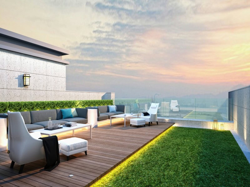
What looks like a relaxing seating area may be too hot or exposed to use for much of the day.
Large blank walls that feel unfinished in person
Minimalism photographs well.
Wide, empty walls create a sense of space and calm in listing images.
In reality, those same walls can feel unfinished or slightly cold, especially without artwork or architectural detail to anchor them.
Mismatched updates that weren’t designed together
Many flips update individual elements without a cohesive plan.
A modern kitchen may sit next to an untouched hallway, or new finishes may clash with existing architectural details.
Each piece may look good on its own, but together they can create a subtle sense of disconnect.
Spaces designed for photos instead of daily routines
The most common issue ties everything together.
When design decisions prioritize how a space looks in photos rather than how it works day to day, the result can feel slightly off once you start living there.
A home may look beautiful at first glance but over time, small inconveniences reveal themselves.
In the end, the difference between a home that photographs well and one that feels good to live in often comes down to the same thing: whether the design was created for the camera, or for real life.
Больше историй
20 дизайнерских ошибок, из-за которых дом мгновенно кажется дешевле, чем он есть на самом деле.
15 renovation choices that actually age beautifully
19 вещей, которые, по мнению дизайнеров, домовладельцы должны перестать делать.
Пост 18 flip features that look good online, but fail in real life впервые появился на Дома с модными брюками.
